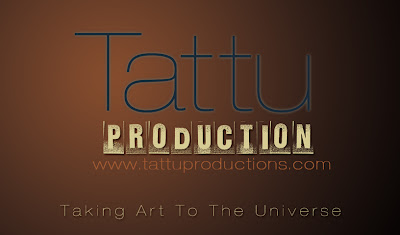
Below are some Business Cards that a client needed.
As you can see my name is on the back of them. The reason would be that Tattu is a third party company that clients would go to for jobs that they would need. When they do come looking for jobs Tattu would contact who would be able to provide the service. hence my name is on the list of freelancers willing to work.
I also designed their website at www.tattuproductions.com. The client was looking for a simple design that would best illustrate the meaning of tattu. "Taking Art To The Universe" is what it stands for. I am excited to be affiliated with Tattu and the work ethics that it stands for.
Saturday, August 7, 2010
Saturday, July 31, 2010
Photoshop Environment Matte Digital Painting
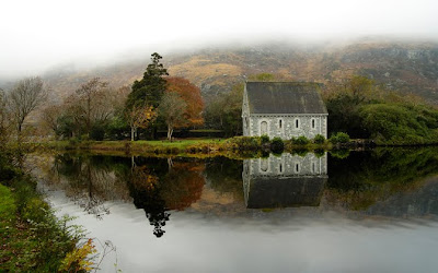
I loved the mood of this image. But I wanted to add to it.
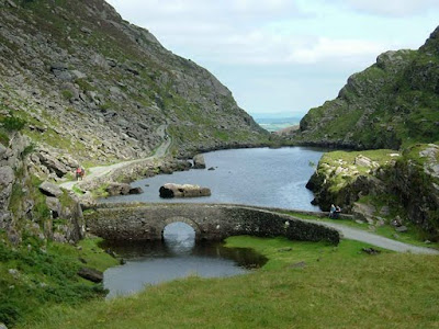
This is was my fore ground image used mostly for the bridge and dirt road. This alone is still a good picture where I can use this the main image and build around it. But not this time around.
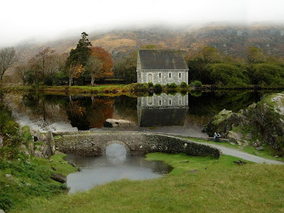
Here is my final result of both images put together. This was a personal project for me to challenge my creative eye. All work was done in Photoshop.
Photoshop Environment Matte Digital Painting
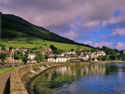
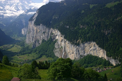
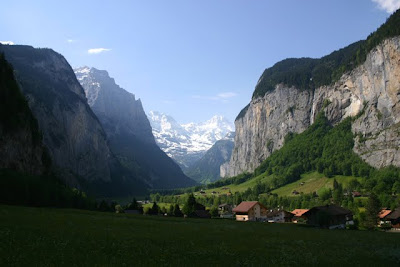
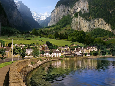
Here is the first image I wanted to use. I wanted to take the foreground of the town.
I used the mountains on the right side and misc. trees in the mid ground and back ground.
I used this image for the back ground an misc. shrubberies around the town.
Here is the final result. This was just a personal project that I wanted to challenge myself with. All work was done in photoshop.
Avenstar Productions: Establishing Vapor Cave
This is a establishing shot of a Vapor Cave concept for Avenstar Productions located in Colorado. I have taken a couple of photos and meshed them into one. Then I brought them into After Effects and created a projection onto solids to created the flat image into a 3d looking environment.
::Production Break downs::
This is the original image that I came across that absolutely loved. I in-visioned the entrance in the background on the right. With a mystery looking block built entrance.
This was a the first mesh of two images to start to bring the entrance together.
This is the final image that has been put together.
Saturday, July 24, 2010
Business Card Design
Here is a business card design that I did for Michelle Campbell. She needed a arts / craft look for her new business that she has in gauged. Michelle needed a back so to display services that she provides. The color scheme I got from the ribbons and I used the Marker flt font naturally. The back ground I used was a metal sheet texture with a color solid (multiply blend mode) on it.
Monday, August 10, 2009
Ancestry Within.com Ad
-Demographic: 12yrs+
-Media: Internet
-Reason: To educate people on their family history and find who their ancestors are.
Ancestrywithin.com is a website that gives anybody worldwide access to
their ancestors and to learn what they have done. Stories, dates, childern,
wars fought any information that you might think of would be found at
ancestrywithin.com. The ad concept would be provided is to give the feel of home and
comfort to ones heart.
Logo Design "rebranding"
This was a forced idea of rebranding so that I can graduate from school. I still like the tree idea so I still kept that thought but used a different tree and placed in a controlled area. Thinking that my roots are from Las Vegas "born and raised" I figured that I will use the roots from the trees as a silhouette under the ground. I wanted to bring back the stamp look so I implemented that idea with some texture instead of a smooth look.
Subscribe to:
Posts (Atom)